BtS: Experimenting with Post-Processing
Added 2022-03-06 17:20:02 +0000 UTC
Hey all!
I'm feeling much better now and am back at work on the renders. There was of course a hiccup along the way, namely an update to the rendering software I used that has completely messed up lighting in a lot of the scenes, but after a few hours this week I found a fix.
Once that was done, in addition to making the new renders, I've been going through QC of the renders I already made and, while I did that, I decided to start experimenting with what the pros call "post-processing" (or "post"). "Post" generally means using a program such as Photoshop for the final touchups to an image. I've done a very light amount of this in QC but only in a very basic sense, such as using Photoshop to fix spots where skin pokes through clothing, but now I'm trying to experiment a bit in terms of making the images pop a bit more.
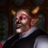
Here are a couple of images. The first is the image after it was rendered with only my usual light Post work (fixing pop-throughs, etc.). The second image is using some of the post techniques that the pros use. I'm not saying this is pro-quality (I'm still learning), but thought I'd share what it could look like.
What do you think? Yay? Nay? Any digital artists out there with thoughts on what I could do differently?
Original (No Post-Processing)

After Post-Processing (version 1)

After Post-Processing (version 2)

Comments
Illumination is always hard, especially in digital art, because it has the danger of looking "pastic-like. However, I like the second version of the photo. What I would say, is "when in doubt, step away for a few minutes and come back. Sometimes when looking at something through a perspective, our eyes need to re-adjust and that's when we get a new perspective on the same item.
Fernando Ruiz
2022-03-14 21:24:52 +0000 UTCThanks! Yeah, I think the image definitely benefits from the additional post. Just a matter of dialing it in.
Bound By Night
2022-03-07 14:21:01 +0000 UTCSee now this is a tough call I personally like the brightness of #2, the skin does look a bit artificial but hey! Alex has green eyes! I like the look of #2 a lot, but #3 does show a bit of details as well. Alex’s bone structure is more apparent due to the shadows, so but we lose the hue of his eye color, but also the ‘waxiness’ of the skin is gone. So the take home is…you could go either way for me because you lose and gain different assets with either. If I had to choose though I prefer #2
Ryan Fox
2022-03-07 06:37:13 +0000 UTCThe second post-processing version is probably the most natural-looking. However, I can imagine situation, where the post-version no. 1 would be more fitting, so it depends... Stay safe and with bright mind :-)
Pilgrim
2022-03-06 23:57:35 +0000 UTCEither the original or version 2 get my vote.
Ray
2022-03-06 22:43:14 +0000 UTCI agree! Some of them have been too dark. I'm looking at ways to automate this with batch processing so I may be able to go back and quickly apply similar effects to earlier images.
Bound By Night
2022-03-06 20:01:20 +0000 UTCI always felt some of your images were too dark, so I like the post as the images seem to be brighter. Both versions of post seem similar to me so it I don't prefer one over the other.
James Tarr
2022-03-06 19:33:25 +0000 UTCSome of the waxy-effect I think is unfortunately related to the skin texture I use for Alex. Sometimes I think about using something else but I worry about a too dramatic shift on him compared to what's already been done.
Bound By Night
2022-03-06 18:38:55 +0000 UTCI like version 2 more than the original, more definition, more expression... it's only slightly too shiny so it feels a bit waxy
LukaM
2022-03-06 18:34:25 +0000 UTC